
Website Design Tips and Trends
Modern Web Development Trends 2022
On the Internet, web design tips are a dime a dozen. Many people have opinions on what the perfect website looks like. That’s because, to a certain extent, website design is subjective. What one person likes, another might find hideous, this is why marketers spend so much time finding out the likes and dislikes of their ideal target market.
At the same time, web design is one of the most important factors for the success of a website. In fact, almost half of website users say that the design of a site is their main factor for judging a company’s credibility from service to product. It’s no wonder we do live in an incredibly superficial society.
As a consequence, it also influences important key metrics such as conversions, bounce rates, dwell times, and more.
New Perspective Design has been in the web design industry for over a decade and has designed websites for a wide variety of industries each with its tastes and target markets. We have a pretty good idea and data on how to create a successful web design. And a bunch of it has been compiled in this article. Stay on the page for some web design tips backed by science and our experience as web developers.
Experience-based Website Design Tips to Crush Your Next Website Project
In the following, you will find some research-based tips and tricks on how to improve your web design.

Make Website Speed an Absolute Priority
It’s probably one of the least debated facts in the web design industry that site speed is important. Research has shown that it influences everything from bounce rate over user satisfaction to conversions and even directly correlates with the revenue your website brings in.
If your site is slow, visitors will not stick around. Period. Website Speed is also a massive ranking factor for search engines because of its ties to user experience. For that reason, it’s paramount that you invest in making your site as fast as possible. So avoid too many external http calls, images, bloated code, and slow servers.
How? The articles below will put you on the right track:
- 10 Reasons Website Performance Matters To Your Business
- 14 Ways To Speed Up WordPress And Decrease Page Load Time
- 13 Performance-Boosting Site Speed Tips for WordPress
- 10 Easy Ways to Speed Up Your WordPress Website [Case Study]
Leverage the Above the Fold Content on your Website
Above the fold content is the content that is seen by visitors when landing on a web page without scrolling and statistics about this say users spend 57 percent of their time above the fold with a sharp decline afterward. 74 percent of their time is dedicated to the first two screenfuls. We had used a tool named hotjar on our website and found these numbers to be pretty accurate.
For your website that means you need to prioritize your content and use the available space to give website users an answer or a reason to keep scrolling. Here are some tips on how to do that on your web pages:
- Use a clear and descriptive headline — Explain what your site can do for visitors, highlight the benefits. Be brief and use power words. For more advice, look into our copywriting tips.
- Include your main call to action — To improve your chances for converting, the fold is the time to start the user journey. Make sure your CTA is clear and visible.
- Include media — Images, videos or audio help emphasize your point. We will talk more about visual content further below.
Find more awesome examples of the practices above in this article.
More Choice Means Fewer Decisions

Hick’s Law states that the more choices an individual has, the longer they will take to make a decision.
There’s actually a fascinating study on this phenomenon in which people in a supermarket were given more or less varieties of jam to try. In the end, those who had more choices were much less likely to end up buying some jam than the ones that had less variety to choose from.
How’s that important for your website? Because you might be able to boost your conversions simply by limiting the choice you give to users. Here are a few examples of what that might look like:
- Reduce the number of menu items ( Don’t use mega menus )
- Limit form fields ( Only collect the most critical data to follow the lead )
- Focus on one call to action
- Only display social buttons for networks you are active on
- Stick to one goal service or product per page
There are plenty of other ways you can reduce overwhelm on your site and move users towards the choices you really want them to make. There’s actually an ebook on that.
Keep Website Design Simple
Continuing with the theme of less, this also applies to your design in general. A huge study by Google has shown that visitors don’t like visual complexity. The gist: the more complex your design, the less it is perceived by visitors as beautiful.
What does that mean for your site? Besides the point above, here are a few ideas:
- Rethink the sidebar — More and more websites are ditching the sidebar in favor of single-column design (for example, the one you are on right now). It means fewer distractions and puts the focus clearly on the content. Sidebars are also traditionally seen as advertising areas and eye-tracking software reveals users avoid them with something called banner blindness.
- Stick to standard layouts — People love familiarity and can get weirded out by non-standard site designs. Therefore, it can be a good idea to stick with familiar design tropes and layouts. You can still find ways to stand out in other ways.
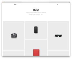
Avoid Carousels, Sliders, Tabs and Accordions
![]()
Website owners love carousels. It’s probably one of the most client-requested features. Unfortunately, the research says that they are pretty useless.
One of the most mind-blowing data comes from Notre Dame University. The webmaster there noticed that the first slide on a carousel received almost 90 percent of the clicks while the rest were largely ignored.
Ninety percent! Doesn’t sound like the other slides are even worth being there, does it? Seems like web designers who talk their clients out of using a slider had it right to begin with. So you should really have a main image and caption and ditch the slider, it will also save space and increase your website speed and sliders and are known to be heavy on website resources.
Also, avoid making your slider look like an advertisement or promotion banner blindness kicks in, and users move right away.
Tabs and accordions have the same problem as sliders and carousels – they often go ignored. This is compounded by the fact that few visitors actually read the entire page. Most people merely scan and are therefore not very likely to make extra clicks to see your content. Accordions also hamper ux design when causing too much animation on smaller screens.
However, what if you need to include the information placed in those areas somehow? We are getting to exactly that right now.
Prioritize Website Scrolling Over Clicking
So, if you don’t compress information into sliders and/or accordions, how do you present it? The answer: just put everything in one long page, including the stuff usually tucked away. Seriously, it works.
There is a fascinating case study by Crazy Egg to prove this point. They went from having a simple, short sales page to one that was 20 times longer than the original.
The result: conversions went up 30 percent! That’s certainly nothing to scoff at.
Seems like users like scrolling down a website a lot more than they like clicking. Clicking is committing and humans don’t like to commit. Therefore, if you are currently spreading the information about your product across many different pages, it’s time to reconsider.
Direct Attention with Visual Cues on your website
One of the main functions of web design is to guide users. You can do that by giving different weight to different elements, thereby directing focus where you want it to go.
However, you can also use more direct visual cues to achieve this. One is by taking advantage of the fact that humans tend to look in the same direction as people they see in ads.
Notice how in the image above, more people are reading the text the baby is gazing at then when the baby was looking at the camera? This is a real thing and you can use this to direct attention on your site where you want it most.
However, you don’t have to be that subtle about steering visitor attention. Sometimes it helps to be blunt about it. For example, in one study, researchers tested the effects mentioned above against a simple arrow pointing at stuff.
Funny enough, the more direct method outperformed the subtle cue.
Let that be a lesson to you.
Use Real Images in Pictures (But Avoid Stock Photos)
Besides using them to direct attention, including other people in images on your site is generally a great idea. Humans like to connect to other people, in real life as well as on the web. It’s why, for example, we have about pages on blogs.
You can see this at work in one case study by Basecamp. They managed to increase their conversions by 102.5 percent by changing from a text-based landing page to one with a large photo of a person in the background.
Simple but effective. However, one caveat: the whole effect is easily negated by stock photos. A Nielsen Norman Group study found that we are very adept at recognizing these generic images and tuning them out.
For that reason, if you are going to use images of people on your site, make sure they are genuine and real. Include your staff or customers. Just say no to stock.
Use the Right List Order
Using lists, both ordered and unordered, is a great way to make information more accessible. However, it turns out that here, too, human attention is fickle.
This is because of the so-called serial-position effect. It says that in a list, you are most likely to remember both the items in the beginning and at the end. The middle section, on the other hand, goes largely forgotten.
The lesson here: When listing attributes of your product or service, make sure to put the most important where they are likely to make an impact.
Leverage Social Proof
The last one of our web design tips is about the so-called conformity bias. This is the tendency of people to do as others do. That means, if a group of people approves of something, others are more likely to do that same.2021 will be the year of diversity when it comes to trends dominating the web design world. From absolute simplicity to over-the-top color and elements combinations, designers will have an array of choices on how to create a website that will stand out among all the other attention-grabbing designs out there.
Web Designers who aim for the best UX and eye-catching website looks should have in mind incorporating some of the web design trends that will dominate in 2022:
- Dark mode
- Minimalism
- Black & white
- Luminous color schemes
- Hand-drawn elements
- Bold typography
- 3D elements
- Shadows, layers, and floating elements
- User-triggered animation
- Multi-colored gradients
- Videos or text-only heroes
This year already looks promising, for both designers who will have their hands full with fusing these trends, but also web design muggles who will get the chance of witnessing and enjoying them all around the Web.
- web development trends 2022
- design trends 2022
- website design trends 2022
- 10 modern web design trends for 2022
- graphic design trends 2022
- 2021 website design trend
- web design trends 2022 medium
- website design 2022


0 Comments