13 Ways to increase website conversion rate
how to increase conversion in sales
how to improve conversion in retail
how to increase conversion rate ecommerce
how to improve conversion rate shopify
how to increase conversion rate in digital marketing
increase conversions meaning
how to improve conversion rate in google ads
website conversion rate
How do you increase conversions on low traffic websites?
What is a good website conversion rate?
In today’s post, we will be exploring 13 ways to increase the conversion rate of your website. Increasing your website conversion rate will lead to increased sales and leads. But first, let’s take a look at what a conversation rate is.
What is a conversion rate? Increasing conversions meaning.
A conversion rate has simply put a percentage. So let’s say your website has a conversion rate of 3% which means that for every 100 people that visit your website 3 will convert. That is how website conventions rates are calculated. Now that may sound like an awfully low amount but when you consider that websites can easily be viewed by thousands of people in a day it’s not that small. So what is a good website conversion rate? The defacto standard for online conversions is between 2% – 5%. Conversion rates can vary vastly between different industries. Conversion rates can translate to most activities so this article will be useful even if you arent looking for answers to just increasing website conversion rates. It also applies to:
- how to increase conversion in sales
- how to improve conversion in retail
- how to increase conversion rate ecommerce
- how to improve conversion rate shopify
- how to increase conversion rate in digital marketing
- how to improve conversion rate in google ads
- website conversion rate
Enough about that for now let’s jump into it. In short, the 13 ways to increase the conversion rate are:
- Limit User Choices with Hicks Law
- Decrease Website Load Times
- Add Live Chat Options To Your Website
- Create Compelling Headlines and Content
- Create a Visually Appealing Design
- Strengthen Your Call to Action
- Leverage Social Proof
- Show Your Credibility
- A/B Testing
- Shorten Contact Forms
- Remove Distractions With Minimalist Design
- Use Faces to Increase Familiarity
- Make your Website Mobile Responsive
- Use a Pop Up With an Offer
1. Limit Choices with Hicks Law
You may have heard of the famous study by psychologists Sheena Iyengar and Mark Lepper where they found that a display table with 24 varieties of jam attracted less interest than a table displaying only six varieties of jam. People who saw the larger display were only one-tenth as likely to buy as people who saw the small display!
That is an example of Hick’s Law in action: action is lost in proportion to the number of choices being presented.
Boost Conversions by Limiting Decisions
HIcks law states that the more choices a consumer has the less likely they are to make a choice. How does this translate into website conversion? Well, it’s simple to limit your number of menu options, products, and packages. Users already have to make a lot of choices when visiting your website things like:
- Deciding whether to use the navigation bar or scroll down the page more
- Skimming the headlines to see which blog post to read
- Deciding whether to download your lead magnet, share your post on social media, or leave a comment
- Choosing between making a purchase, reading product reviews, or browsing for more products
These only just scratch the surface of the plethora of decisions that your users have to make. It’s normal to feel overwhelmed trying to figure out where to begin cutting back on these decisions, however, there is a simple way to use Hick’s Law in a pinch…
Add a Hero Call to action.
Your hero image is the main image that pops up at the top of your page taking most of the screen space. In this hero image, you choose one thing, service or product, the item that’s most important to your business profit they can choose to interact or not. If they want to see more choices, they’ll have to scroll down.
This allows you to minimize distractions on your homepage, while still keeping the functionality of your homepage intact.
Overall, when applying Hick’s Law to your website design, you need to know which actions are the most important for your bottom line. For example, do you want users to opt-in for your lead magnet, or do you want them to put a product in their shopping cart? Every page on your website should achieve one main objective.
The more you can limit your user’s choices, the easier your website will be to use, and your conversions will skyrocket.

2. Faster Loading Websites = More Conversions
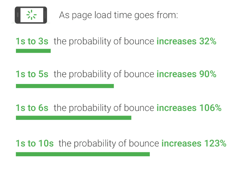
This is one of the easier ways to increase conversion rates on your website. Consider this: Between seconds 0 and 5, the e-commerce conversion rate decreases by an average of 1.2% for every additional second it takes for your website to load. Now read this: The average time it takes a mobile landing page to load is 22 secondswhich impacts the average website conversion rate significantly.
It clearly means that even the least wait time in website loading can negatively impact user engagement and online conversions.
Website loading time is one of the common challenges reported by many customers. Admittedly 0.5 seconds is a ridiculous time to chase, but your website should not take more than 2 seconds to load. This will increase bounce rates as users get frustrated and thus decrease conversions. Its also been shown that users perceive brands with a slow website as lower quality.
It helps to increase website engagement rates and boost customer satisfaction.
How can you optimize your website loading time to increase average website conversion rates?
Google Analytics offers speed suggestions under the heading speed of the website. There are tools like GTMetrix and even better Google’s own lighthouse which give amazing insights into what’s making your website load slow. These tools can be used to get website speed suggestions if your site happens to load slowly
3. Add live Chat to convert users.
Live chat is a great tool to increase your conversion rate. It’s a fast and convenient way for clients to get information that may be stopping them from converting. It also puts a personality behind the brand and is a great way to showcase your customer support.
You also get the chance to talk to the client while they are in the process of making a decision, with some sales talk you can sway them towards converting. When website visitors dont convert, they might have a question or concern about your product or service.
To avoid losing potential customers, you should consider adding live chat to your site.
With live chat, your customer service or sales employees can alleviate the concerns of prospects who are on the fence. It can also gain you valuable insights into how to work on your conversion optimization via client feedback.

4. Compelling Headlines and Content
Most people who visit websites skim through headlines. A well-written headline can make a user stop and read the following paragraph. It is important to pay attention to your headlines. Are they speaking to the client’s needs? Similarly, your website content needs to speak to your specific client.
Some clients want all the details, the brand stories, and some clients want to know what you offer and how much it costs. Get it wrong and you will lose a conversion because your website speaks more about you than your product, or your website is too promotional without any backing. Increasing conversions means getting the right balance of this for your ideal clients.
When someone clicks on your site after reading your meta description on Google or seeing your search engine ad, your landing page needs to follow through.
You have to deliver on the promises that were made in that copy. For example, if a user sees this post in Google, they’re going to expect to find strategies to improve their conversion rate. If they clicked through and this page only had pictures of puppies, they’d be confused.
If a landing page doesn’t deliver on what a user thought they were getting, they won’t convert. That’s why you need to think about the entire process from seeing an ad, going to your landing page, and downloading an offer.
If a landing page isn’t converting, review your social media posts and search engine descriptions to see if you follow through on the promises you made.
5. Create a visually appealing design
According to the Stanford Persuasive Technology Lab, 46% of site visitors say a website’s design, including font size, color scheme, layout, and site navigation, is the #1 criterion for discerning the credibility of the company.
So your design must look professional. This is where you would need the help of a professional UX or graphic designer.
If your website is not attractive, customers will actually leave your site altogether. Just like your content your website needs to speak to your specific target audience, today’s online world is all about personalization for users. Here are some tips for great visual design to increase website conversions.
- Communicate credibility – If you have an amazing product, but if no one understands what you are saying, then you won’t be able to sell it.
- Design & color – Visually appealing website first catches your eye and provides an instant layer of communication.
- Picture & graphics – The photos and graphics used can go a long way toward communicating an authentic, solid first impression.

6. Call to actions affecting conversion rates.
When we talk about creating a good call to action ( CTA ) to increase conversions there are a few components to them, such as the text, the position, and even the color all can increase or decrease conversions.
Color – Conversion change based on color contrasts.
You can choose colors by exploring studies on color psychology. We found that having a red CTA button increased conversion rates by 15%.
But you can opt for any combination as long as it’s attention-grabbing and does not conflict with your brand’s or background’s main colors.
You can choose complementary colors or contrasting colors via color wheels.
Text – Use First-Person Action Verbs and Power Words
They say words have power and the same is true when writing CTAs.
You need to choose words that evoke a sense of urgency and momentum to your offerings. Some call-to-action words or phrases that maximize conversions include:
- Get
- Visit
- Now
- Learn
- Last
- Today
- Buy
- Shop
- Try
Using these calls to action with the correct content and color is sure to increase your conversion rates and A/B testing is an important part of monitoring the effectiveness of changes and applying conversion optimization.
7. Include social proof.
Did you know that 89% of consumers check online reviews before making a purchase? The Canvas8 study commissioned by Trustpilot also found 49% of consumers consider positive reviews one of their top three purchase influences. Without a doubt, your reputation and online presence impact your conversion rate.
That’s why you should include social proof on your site.
You can link to your Google my business profile or any other directory page where customers have left reviews.
Additionally, you should also add testimonials and reviews right on your site so visitors don’t have to go to a third-party site.
It should be apparent that your customers have enjoyed using your product or service. If it isn’t, your conversion rate will suffer.

8. Show your credibility
In the online world where people cannot directly see you, your store, products, or services credibility is incredibly important for conversions.
Customers are skeptical by nature, and it doesn’t help that so many people get scammed on the internet, it is for you to convince them that buying your products or services is a good choice. You need to instill confidence in your visitors that your brand is credible and helps to resolve their problems thus, worth investing in.
Brand credibility is vital to prove your worth to potential customers. It helps you to generate more leads, boost conversions, and enhance engagement on your website. So how do we do this?
Testimonials are a great way of strengthening your brand credibility and increasing website conversion rates significantly. Testimonials are a vital part of your marketing strategy as they can persuade consumer decisions. Depending on if you offer a service or sell a product, you could have a project showcase, product reviews, and portfolios to show what your business has done and what your potential client can look forwards to. Including links to your shipping company, payment gateway, and SSL certificate provider have all been proven to increase conversion rates.
Leveraging testimonials can be a great website conversion tip to capture customers with the right information at the right time.

9. Utilize A/B Testing
A/B testing is one of the components of the overarching process of Conversion Rate Optimization (CRO) using which you can gather both qualitative and quantitative user insights and use them to understand your potential customers and to optimize your conversion funnel. See which of these test result in a higher customer engagement. On an eccomerce website example you would like to test with features such as cart abandonment strategies to win back more users, sales emails, and different landing pages.
How does A/B testing help to increase website conversion rate?
- Resolve pain points of website visitors by using the data collected by behavioral analytics tools such as Google Analytics, and heatmaps to resolve visitor’s issues.
- Gain better RoI from the existing traffic by allowing you to make the most out of your existing traffic and increase online conversion without having to spend on acquiring new traffic.
- Reduce the bounce rate by testing multiple variations of a website element until you find the best possible version. It improves your user experience, making visitors spend more time on your site and reduce bounce rates.

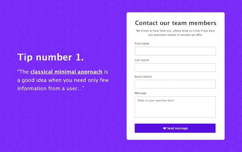
10. Shorten your forms.
One reason that users don’t convert is that there’s friction in the process. For example, if you have a long-form, visitors might be hesitant to fill it out. Users like to have things easy and yes we understand that you will need more information. Your initial goal should have been to get the lead and this requires nothing more than a name, email, and telephone number.
Dan Zarrella at HubSpot recently researched the contact forms of 40,000 of their customers and found that conversion rate improves by almost half when the number of form fields are reduced from four fields to three.
Stop and read that again: eliminate one form field and increase conversion by 50%.
11. Remove distractions with a minimalist design
There’s nothing worse than visiting a website that pulls you in too many directions. This one is a win win, it help with hicks law as mentioned above, also having less elements should allow for a faster website.
Your landing page should be clear, concise, and easy to navigate. If it’s not essential, don’t include it. Stick with what your visitors need to know and nothing else.
When possible, implement the following (and not much else):
- Headline and subheadings
- Benefits and features
- Testimonial and/or reviews
- Visual combined with context, which shows what you’re offering
There are other things to consider – such as a live chat box, social proof, and video (more on these below) – but the point remains the same: eliminate all distractions. You want your visitors to focus on your offer and nothing else.
This is one of the easiest ways to find conversion increases on the critical pages of your site.

12. Use People’s faces on your website images.
People love human faces. “When we see a face, we are automatically triggered to feel something or to empathize with that person,” says designer Sabina Idler. “If we recognize content on a website — such as a problem, dilemma, habit or whatever else — we feel connected and understood.”
Make sure to incorporate faces into your articles, case studies and testimonials, opt-in pages, and landing pages for a boost in your conversions.
If you are the face of your brand, this is simple to do. Get a photoshoot done, and make sure the photographer takes plenty of horizontal shots with negative space on one side of you. That way, you’ll be able to place a call to action or some text there.
However, if you aren’t the face of your brand, you can still use faces on your website by hiring models, or using stock photos. Just make sure the faces you choose represent your brand accurately so that the user will be able to relate to the face.

13. Make your Website Mobile Responsive
Mobile devices are an integral part of everyday life that we all see our phones once we leave the house. Mobile users accounted for a whopping 56% of website traffic.
For website owners, such a shift in how people interact with the web is quite normal. But it increases the urgency you need to have in making your website mobile responsive. If your mobile visitors don’t have a good experience when they land on your website, you are possibly driving away from a huge portion of your potential traffic.
Best practices to appease your mobile as well as desktop op users to increase online conversions:
- A responsive website includes the same content and information on mobile devices you access.
- Make sure that the information users are looking for is easier to find when they land your website.
- You need to ensure that the button sizes are designed to work on the mobile should be good enough.
- At times, mobile users prefer to see the desktop version of your website so allow an easy way to switch to desktop view.
- It is better to use larger font sizes as it makes reading easy on the smaller screen.

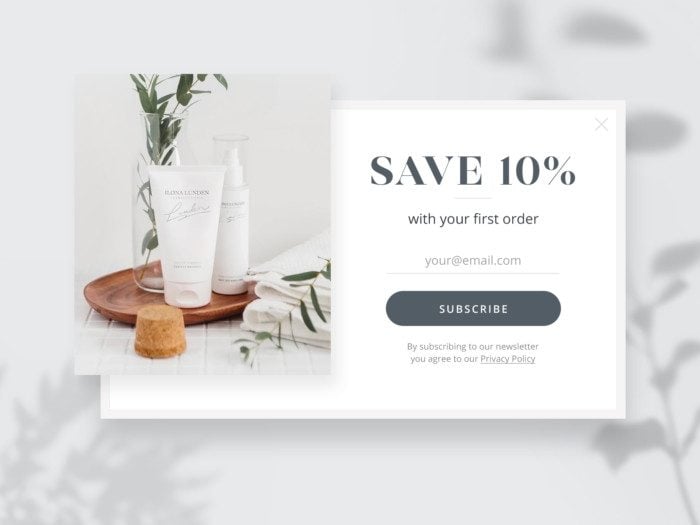
Use POP UPS to get another chance or force a decision.
Pop-ups when used correctly, meaning they appear at the right time, in a timely fashion, and offer something relevant to the user, becomes an effective tool that pushes users to move forward in your sales conversion funnel. Why do web page contact forms convert at such a low percentage? It’s because they are not offering anything of value in return. A visitor who is ready to identify themselves wants to speak to sales, and has specific questions they want to be answered will fill out a web contact form. Visitors aren’t likely to fill out a contact form just because you ask nicely.
The bottom line is, the more helpful your pop-ups are, the more likely they are to increase conversions on your website.
Here are some quick tips for getting the highest website conversions from them:
- Capture attention in the landing pages – Pop ups can grab your visitors’ attention at the right moment.
- Experiment with several offers (PDFs, premium content, different products) until you find a winner that you can feel right away.
- Set a cookie by using pop up tools so the pop-up only appears once per user. Make pop ups easy to close to avoid customer frustration.
Combining all the above tips can give a huge boost in conversions and reduce customer complaints to zero.

Bonus Tip: Use AI, but use if carefully.
There are multiple ways in which AI can help boost your conversion rates.
One such method is by allowing it to process data for you. AI can process vast sets of metrics and output some valuable insights — perhaps finding patterns where you can improve based on your analytics or website PPC reports. The catch here is you need to know what you are looking at, because AI can (and does) make mistakes. Your outputs from AI are only as good as what you put in.
On the other side of the coin, on your website, you can use AI as a chat tool. This is effective if you don’t have the capacity to answer fast. Faster answers to queries have naturally been shown to increase conversion rates, and AI can be your 24-hour, instant, dynamic salesperson. The catch here again is to train your AI and carefully assess what it says — it will need fine-tuning. You can use training methods like Pinecone vector DB.


0 Comments