An introduction to What good web design principles are…
What makes a good website? 8 principles of a good website design.
Good website design is essential for creating an engaging and user-friendly website. It involves the use of various elements such as layout, color, graphics, and content to effectively communicate a brand’s message and provide an optimal user experience. A well-designed website should be visually appealing, easy to navigate, and accessible across different devices. It should also be optimized for search engines and load quickly to ensure a positive user experience.
Good web design also takes into account the needs and preferences of the target audience, creating a seamless and enjoyable interaction with the website. Additionally, a good web design includes a strong focus on usability, ensuring that visitors can easily find the information they are looking for and complete desired actions, such as making a purchase or contacting the company.
Overall, good web design plays a crucial role in establishing a brand‘s online presence and can greatly impact its success. By investing in good web design, businesses can attract and retain customers, stand out from competitors, and ultimately achieve their online goals. It is therefore important to prioritize good web design when creating or revamping a website to ensure its effectiveness and success.
1. Don’t Squander Users’ Patience
In the fast-paced world of internet browsing, website visitors have little patience for slow-loading websites. It is crucial for businesses to optimise for a good website loading speed in order to retain the attention of potential customers.
Good web design goes hand in hand with a speedy website, as it involves creating an aesthetically pleasing and user-friendly interface that caters to the needs of the audience. Characteristics of good web design include a clean and organised layout, intuitive navigation, and fast loading times. By prioritizing these elements, businesses can ensure that users are not squandering their patience while waiting for a website to load. Additionally, incorporating responsive design that adapts to various devices and screen sizes is also essential for providing a seamless browsing experience.
Ultimately, a well-designed website that loads quickly not only improves user satisfaction but can also positively impact search engine rankings and overall online performance. By respecting users’ time and attention, businesses can establish trust and credibility, ultimately leading to increased engagement and conversions. So, it is imperative for businesses to invest in good web design and to optimise website loading speed in order to avoid squandering users’ patience and losing potential customers.
2. Use white space in your design guidelines

In good web design, less is more, and this principle can be effectively applied through the use of negative space. Negative space, also known as white space, refers to the empty or unused space in a design. By strategically incorporating negative space into a website’s layout as a design element, designers can create a clean and uncluttered look that enhances the overall user experience.
Negative space helps to draw attention to the important elements on a webpage, such as text, images, and call-to-action buttons. When utilized properly, negative space can also improve the readability and comprehension of the content, making it easier for users to navigate and interact with the site and helps create a visually appealing website
Negative space can convey a sense of elegance and sophistication, giving the website a modern and minimalistic aesthetic.
By allowing elements to breathe and stand out, negative space can also make a website feel more spacious and inviting for users. Ultimately, by embracing the concept of “less is more” in web design, and utilizing negative space effectively, designers can create websites that are visually appealing, user-friendly, and impactful.
3. Make Sure your website is fully mobile-responsive

It is essential for businesses to have a fully mobile-responsive website. With the majority of internet users accessing websites from their mobile devices, it is crucial for a website to be accessible and user-friendly on all screen sizes. This is where responsive design comes into play.
A responsive design ensures that a website adjusts and looks great on any device, whether it be a smartphone, tablet, or desktop computer. In fact, many web designers and developers now follow a “mobile first” approach, where they prioritize the mobile experience and then adapt it to larger screens.
This not only ensures a seamless user experience for mobile users but also helps with search engine optimization, as search engines like Google now prioritize mobile-friendly websites in their rankings. Therefore, it is imperative for businesses to invest in a mobile-responsive website to stay competitive in today’s digital landscape. Not only does it improve user experience, but it also has a direct impact on the success of the business, as potential customers are more likely to engage with a website that is easy to navigate and visually appealing on their mobile devices.
4. Keep your website design consistent
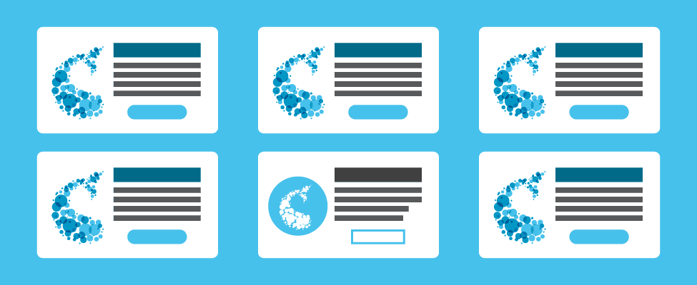
Consistency in website design is crucial for providing a positive user experience. When visitors come to your website, they should be able to easily navigate and understand the layout, regardless of what page they are on. Keeping a consistent design throughout your website helps to establish a sense of familiarity and makes it easier for users to find the information they are looking for. A uniform design also ensures that users don’t get confused or frustrated while browsing, which can lead to higher bounce rates and lower engagement.
Consistency in design includes using the same color scheme, typography, and layout across all pages. It also means maintaining a cohesive brand identity and keeping elements such as navigation menus and call-to-action buttons in the same locations. By doing so, your website will feel more cohesive and intuitive to use, ultimately leading to a better overall user experience.
So, whether it’s the homepage, a product page, or a blog post, keeping the design consistent is key to ensuring that users have a positive and seamless experience. Don’t confuse users with a haphazard design – instead, strive for uniformity and make it easy for visitors to navigate and engage with your website.
5. Strive For Simplicity with easy navigation and web Design
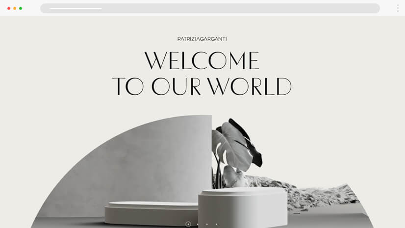
When designing a website, it is important to strive for simplicity in both navigation and overall design. A cluttered and overly complicated website, with a bad visual hierarchy, can be overwhelming for visitors and can lead to frustration and ultimately, the loss of potential customers. By focusing on easy navigation, users can quickly and intuitively find the information they are looking for.
This can be achieved through clear and logical menu structures, as well as the inclusion of search functionality for easy access to specific content. In addition to navigation, the overall web design should also prioritize simplicity. This includes a clean and uncluttered layout, easy-to-read fonts, and a minimal use of distracting graphics or animations. By keeping the design simple and user-friendly, users can easily focus on the content they need without being overwhelmed by unnecessary elements.
Mobile responsiveness is also crucial as more and more users access websites through their smartphones and other devices.
By prioritizing easy navigation and simplicity in web design, businesses can ensure a positive user experience, leading to increased engagement and satisfaction. This, in turn, can lead to higher conversion rates and ultimately, business success.
By keeping the design simple, the focus remains on the content and the user experience. Furthermore, a simple and intuitive design also leads to faster load times, which is important for retaining visitors and improving search engine rankings. Ultimately, the goal of striving for simplicity in website navigation and design is to create a positive experience for users, encouraging them to explore and engage with the content on the site.
Use a complementary color palette for effective web design
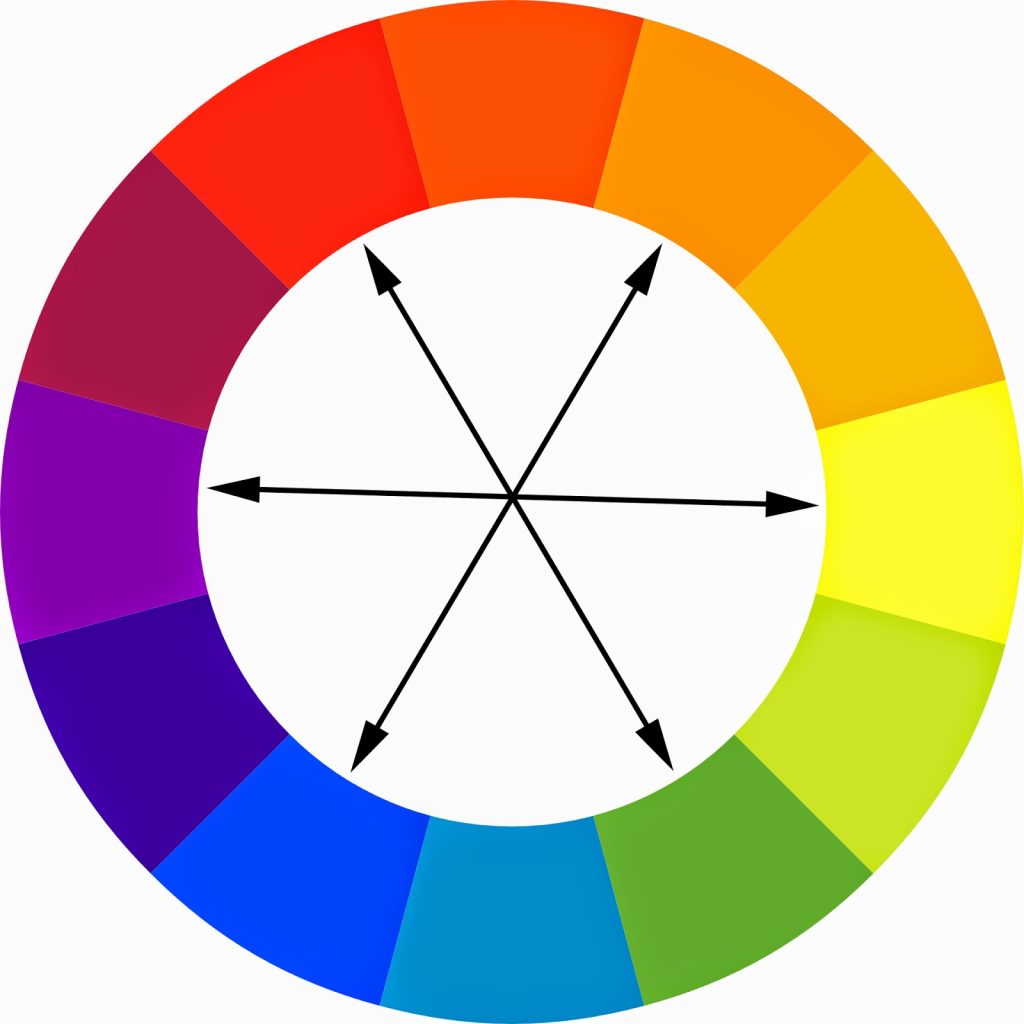
When it comes to effective web design, choosing the right color scheme can make a huge impact on the user experience. One popular and effective approach is to use a complementary color palette. Complementary colors are hues that are opposite each other on the color wheel, such as red and green, blue and orange, or yellow and purple. It assists with a better visual
When used together, these colors create a high contrast and dynamic visual impact that can make a website stand out and capture the attention of the user. This can be particularly useful for call-to-action buttons, important links, or other elements that you want to draw attention to.
Additionally, complementary colors can create a sense of harmony and balance when used in the right proportions, making the overall design more visually pleasing. However, it’s important to use complementary colors in moderation to prevent overwhelming the user with too much contrast. When implemented thoughtfully, a complementary color palette can enhance the overall aesthetic and functionality of a website, helping to create a more engaging and memorable user experience. In addition to creating harmony and balance, complementary colors can also be used to draw attention to specific elements on a website, such as buttons, call-to-action messages, or important information. By strategically using complementary colors in these areas, designers can guide the user’s eye and emphasize the most crucial parts of the website.
When selecting complementary colors, it’s essential to consider the overall brand image and message. The chosen colors should reflect the brand’s personality and values, helping to reinforce its identity and create a consistent visual language across different platforms.
Furthermore, designers should also keep in mind the accessibility aspect of using complementary colors. It’s crucial to ensure that the color combinations chosen do not hinder readability or pose challenges for users with color vision deficiencies.
In conclusion, while complementary colors can be a powerful tool for creating visual appeal and engaging user experiences, they should be used thoughtfully and in moderation. By considering brand identity, accessibility, and user experience, designers can leverage the benefits of complementary colors to enhance the overall design of a website.
7. Prioritize the user experience

Good website design prioritizes the user experience by ensuring that the website is easy to navigate, visually appealing, and provides valuable content. A well-designed website takes into consideration the needs and preferences of its users, offering a seamless and intuitive experience.
This means that the layout of the website should be organized and responsive, allowing for optimal viewing on different devices and screen sizes. Additionally, good website design incorporates user-friendly features such as clear and concise navigation menus, prominent search bars, and easily accessible contact information. Focus on the usability of your website.
Visual elements such as images, videos, and color schemes are carefully chosen to enhance the overall user experience, while also reflecting the brand’s identity. Furthermore, good website design ensures that the loading speed is fast, optimizing performance and minimizing frustration for users.
By placing the user at the forefront of the design process, a good website not only attracts visitors but also keeps them engaged and coming back for more. Ultimately, prioritizing the user experience in website design leads to increased satisfaction, improved conversions, and a positive brand image.
8. Test Early, Test Often
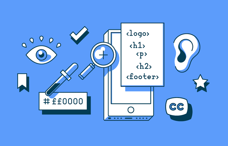
You should look a tools like you Google analytics, and Visual tools like hotjar to see how users act on your website. You can see where ottle necks are where users get stuck and where they spend time. This will give you an idea on where to improve on your website with ab testing.
A good website is never finished, users change, the way they use websites change. Its crucial to remember when designing a good website, you are noted designing it for yourself but for the user.
By consistently testing and analyzing user behavior, you can make data-driven decisions to improve the user experience on your website. This could include making changes to the layout, navigation, content, or any other elements that might be causing friction for users.
It’s important to keep testing and iterating to ensure that your website is always meeting the needs of your users. Remember, a successful website is one that is designed with the user in mind, not just for your own preferences. Keep testing early and often to ensure that your website remains effective and user-friendly. Test different layouts, features, and functionalities to see what resonates best with your users. Collect feedback from your target audience and use tools like heat maps and user recordings to understand how people are interacting with your site. This will help you identify any pain points and make necessary adjustments.
It’s also important to keep up with the latest web design trends and technological advancements to ensure that your website remains relevant and competitive. Regularly update your content and make sure that your website is optimized for different devices and browsers to provide a seamless user experience.
By constantly testing and iterating, you can continuously improve your website and provide a better experience for your users. This will ultimately lead to increased engagement, higher conversion rates, and overall success for your online presence. Remember, the key to a successful website is to always prioritize the needs and preferences of your users.
To sum it all up:
- Don’t Squander Users’ Patience
- Use white space in your design guidelines
- Make Sure your website is fully mobile-responsive
- Keep your website design consistent
- Strive For Simplicity with easy navigation and web Design
- Use a complementary color palette for effective web design
- Prioritize the user experience
- Test Early, Test Often
Good web design is essential for creating a positive user experience and achieving the goals of a website. The definition of a good web design encompasses several characteristics that contribute to its effectiveness. It should prioritize the user experience, strive for simplicity with easy navigation and design, and use a complementary color palette for visual appeal. Additionally, good web design should make sure the website is fully mobile-responsive, keep the design consistent, and utilize white space in the design guidelines. These characteristics all contribute to creating a website that not only looks good but also functions well.
When designing a website, it’s important to consider the user’s perspective and not squander their patience. Users should be able to easily navigate through the website and find the information they are looking for without any unnecessary obstacles. Prioritizing the user experience means considering the needs of the users and catering the design to make their interaction with the website as smooth as possible. Testing early and often can help identify any design flaws and improve the overall user experience.
Overall, good web design is about creating a visually appealing, functional, and user-friendly website. It should be easy to navigate, visually appealing, and mobile-responsive. By implementing these characteristics and considering user experience, web designers can create a website that effectively communicates the intended message and provides a positive experience for visitors.




![The Impact of Having a Business Website: A Survey Conducted by New Perspective Design in South Africa [Case Study 2025]](https://www.newperspectivestudio.co.za/wp-content/uploads/2025/02/The-Impact-of-Having-a-Business-Website-survey.jpg)


