Typography in Web Design: Best Practices
In the digital age, the presentation of content on a website is just as crucial as the content itself. One of the most overlooked yet vital aspects of this presentation is typography. Typography in web design ensures that the text on a website is not just legible but also aesthetically pleasing. It plays a pivotal role in setting the tone, mood, and overall visual appeal of a website. This article delves deep into the world of web typography best practices, providing insights and guidelines to enhance the user experience through effective typography.
This article intends to answer the following questions:
Key Takeaways:
- Typography in web design is crucial for readability and user experience.
- Limiting the number of typefaces and choosing the right font size can significantly impact the visual appeal.
- Proper spacing, color choices, and avoiding text animations are essential for optimal readability.
- Testing and feedback are vital for ensuring that the typography resonates with the target audience.
What is Typography in Web Design?
Typography determines how text appears to the reader. In the context of web design, typography is about ensuring that the text on websites is both visually appealing and readable. Digital text needs to cater to shorter attention spans, be skimmable, accessible to all users, and legible across multiple device types and screen sizes. Thus, web typography gets its unique category, encompassing the design of the text itself and its presentation on the web page.
Web Typography Terms
Understanding the terminology is the first step towards mastering web typography best practices:
Typefaces and Fonts
A typeface is a specific design applied to a set of characters, like Times New Roman or Arial. A font is an instance of a typeface with a particular weight, size, and style. For instance, “Helvetica Bold (20pt)” is a font in the “Helvetica” typeface.
Serif and Sans-Serif Fonts
Serif fonts have small projections off the main stroke of a letter, while sans-serif fonts lack these. Sans-serif fonts are generally more readable in digital contexts.
Kerning and Tracking
Kerning is the space between two specific characters, while tracking denotes the overall spacing between letters in a line or block of text.
Leading
Leading is the vertical spacing between lines of text, ensuring that there’s adequate space for readability.
Hierarchy
Hierarchy in web typography refers to the order of text from most to least prominent, helping in easy navigation.
Website Typography Guidelines
Limit the Number of Typefaces
To maintain a cohesive look, use no more than two different typefaces across your website. This ensures visual consistency and professionalism.
Use a Sans Serif Font for Body Text
Sans serif fonts are more readable in digital contexts. While serif fonts can be used for headings or decorative sections, body text is better off “sans.”
Stick to Standard Fonts
Standard, or web-safe fonts, ensure that your text is readable across all browsers and devices. They are familiar to readers and lack design flaws seen in some other fonts.
Size Your Text Appropriately
A common practice is to set all website text to a minimum size of 16px. This ensures that most people can read without zooming in. Headings should always be larger than body text to establish hierarchy.
Don’t Use All Caps
Using all caps can come off as shouting and is harder to read. For emphasis, it’s better to bold the text.
Use Colors Carefully
Ensure a good contrast between text and background color. The Web Content Accessibility Guidelines recommend a contrast ratio of at least 4.5:1 for most text.
Limit Line Length
Aim for a line length of 60-70 characters for optimal readability.
Provide Sufficient Spacing
Proper spacing between lines and paragraphs ensures easy readability.
Eliminate Text Animations
Avoid using flashing or moving text as it can be distracting and even harmful to some users.
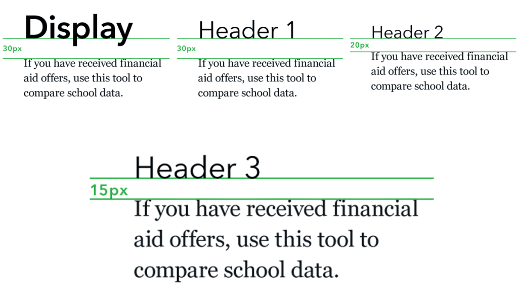
Web Typography Hierarchy
Understanding web typography hierarchy is crucial for effective web design. It ensures that the content is legible, readable, and presents a clear information structure.
Headings and Their Importance
Headings act as content guides. By merely glancing at your headings, a reader should grasp how you’ve organized your content. Think of the front page of a newspaper:
- H1 is the big statement on the page.
- H2 are smaller headings that fit into the big statement.
- H3 are even more detailed.
Classes in CSS can be used to create a consistent style for headings across your site. This ensures uniformity and a coherent visual experience for the user.
Text Fills and Their Usage
Text fills apply color to the inside of text. They can be used to create visually appealing headings or to emphasize certain parts of the content. For instance, a gradient fill can make a heading stand out on a webpage.
Paragraphs and Text Inheritance
Parent elements can pass text-style information down to their children. This is particularly useful for setting global font styles or aligning text inside sections. It ensures consistency and reduces the need to style each element individually.
Units in Typography
Typography units define the size and spacing of text elements. Common units include:
- Ems: Based on the width of a typeface’s capital M.
- Rems: Relative to the HTML font size.
- Percentages: Refers to the parent element’s font size.
- VW: Based on the width of the browser’s viewport.
- CH: Useful for limiting the number of characters per line.
Understanding and using these units effectively can make a significant difference in the readability and visual appeal of a website.
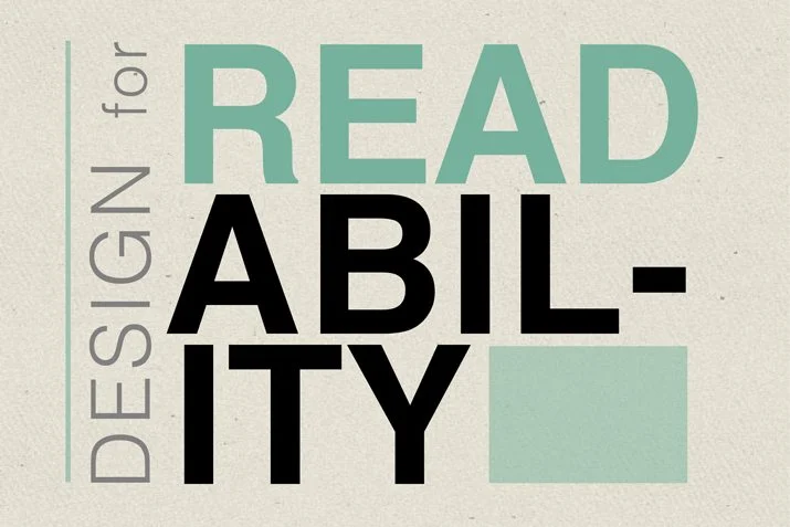
Accessibility and Inclusive Typography
Ensuring that your website is accessible to everyone, including those with disabilities, is not just a good practice in website UX design—it’s a necessity.
Font Legibility
Choose fonts that are easy to read. Thin fonts or fonts with uneven weight distribution can be challenging to decipher, especially in long paragraphs. A general rule of thumb is to keep the font size no smaller than 16 pixels for body text.
Alignment of Text
Avoid uneven vertical alignment as it can disrupt the reading flow. Jagged text alignment, especially in centered text, can make it hard for the reader to transition from one line to the next.
All Caps
Using all caps, especially in longer paragraphs, can increase cognitive load for the reader. It’s best to use capitalization where it’s needed or expected.
Color Contrast
The contrast between the background and foreground is vital for readability. High contrast usually leads to increased legibility. Tools like Webflow’s built-in Color contrast checker can be used to assess the contrast ratio of your text against its background.
Line Height and Spacing
Adequate line height makes text less overwhelming and easier to read. It’s recommended to have a line height that’s at least 1.5 times the font size for paragraphs.
Clearly-defined Links
Links should be meaningful and actionable. Avoid using generic terms like “click here” or raw URLs as hyperlinks. Instead, embed links in clear, specific language that informs the reader about the destination.
Remember, typography in web design is not just about choosing a beautiful font. It’s about ensuring that the content is presented in a way that’s easy to read, understand, and engage with. Proper typography enhances user experience, reinforces brand identity, and ensures that the message is effectively conveyed to the audience.

Frequently Asked Questions (FAQs)
1. What is Typography in Web Design?
Typography in web design refers to the art and technique of arranging type on a website. It encompasses everything from font style and size to spacing and layout, ensuring that the text is both visually appealing and easily readable.
2. Why is Typography Important in Web Design?
Typography plays a pivotal role in enhancing the user experience on a website. Proper typography ensures readability, provides a visual hierarchy, and reflects the brand’s personality. It can also influence the mood and emotions of the user.
3. How Many Typefaces Should I Use on My Website?
It’s recommended to limit the number of typefaces to two or three to maintain visual consistency and professionalism. Using too many typefaces can make the website look cluttered and reduce readability.
4. What is the Difference Between Serif and Sans-Serif Fonts?
Serif fonts have small projections or “feet” at the end of letter strokes, while sans-serif fonts lack these. Serif fonts are often used for print and long-form content, while sans-serif fonts are more common in digital design due to their clean and modern appearance.
5. How Can I Ensure Good Contrast for Readability?
Ensure a significant contrast between the text and its background. Tools like Webflow’s built-in Color contrast checker can help assess the contrast ratio of your text against its background.
6. What is Web Typography Hierarchy?
Web typography hierarchy refers to the arrangement of text in order of importance. It helps guide the reader’s eye and provides a clear structure to the content. Headings, subheadings, body text, and captions are all part of this hierarchy.
7. Are There Any Tools to Generate Typography for My Website?
Yes, there are several online tools and platforms, such as website typography generators, that can help you select and generate typography combinations for your website.
8. How Do I Choose the Right Font Size for My Website?
A common practice is to set the body text to a minimum size of 16px. Headings should be larger to establish a clear hierarchy. However, the choice also depends on the chosen font and the design aesthetics of the website.
9. What is the Recommended Line Length for Web Content?
For optimal readability, it’s recommended to have a line length of 60-70 characters.
10. How Can I Improve the Accessibility of My Web Typography?
Ensure that your website typography is legible, provides good contrast, and is sizable. Avoid using all caps for long paragraphs, and ensure that links are distinguishable from regular text.
For more insights on typography in web design, you can explore the following resources from New Perspective Studio: