Case Study: Baroka Funerals — Website Redesign Cse Study
Case Study: Baroka Funerals
Website Redesign, SEO Realignment & Measurable Growth (Johannesburg & Pretoria)
Background and context
When Baroka Funerals, a trusted funeral services brand operating across Johannesburg and Pretoria, approached New Perspective Design, the goal was clear.
They wanted a website that matched the strength of their brand and simplified how South Africans engage with their services online.
Baroka already had a strong offline presence. Their brochures, printed material, and social media carried a consistent visual identity. They were active in the market and recognised within their regions. However, their website did not reflect that same credibility.
The design felt dated.
Navigation was cluttered.
The user experience made it difficult to understand what services were offered and how funeral plans differed from one another.
From a performance perspective, the site also wasn’t delivering. Despite ongoing marketing activity, the website itself wasn’t supporting visibility or discovery in search. In short, the site existed — but it wasn’t working hard enough for the business.
This wasn’t a branding problem.
It was a foundation problem.

What we found before touching design or SEO
Before proposing solutions, we audited the site as a system rather than a collection of pages.
Several issues surfaced quickly:
-
SEO fundamentals were inconsistent and poorly implemented
-
Content was unstructured and duplicated across pages
-
Over 200 pages were indexed, many of which should never have been visible to search engines
-
Internal and structural pages were competing with core service pages
-
UX did not reflect the emotional and informational complexity of funeral planning
Funeral plans are not a simple product comparison. They involve financial decisions, cultural considerations, and emotional sensitivity. The existing website attempted to solve this complexity by adding more content and more pages, which had the opposite effect.
For users, the experience was overwhelming.
For search engines, the site lacked clarity and intent.

Design and UX: reducing cognitive load without losing depth
The website redesign brief was not “make it look modern”.
The real challenge was to reduce cognitive load while still supporting a wide range of services and plans.
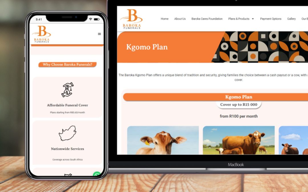
We began by analysing Baroka’s established visual language — warm orange tones, clean typography, and compassionate imagery used consistently across their offline and digital materials. The new site needed to feel immediately familiar to existing customers while being clear and reassuring to first-time visitors.
Using WordPress and Elementor, we developed a fully custom theme aligned with their brand. Every layout decision was driven by how users actually move through the site:
-
Information is revealed progressively, not all at once
-
Core services are easy to identify without being visually aggressive
-
Supporting information is accessible without dominating the journey
Funeral cover, tombstones and memorials, repatriation services, and plan comparisons were all structured to guide users rather than confront them with choices.
UX here was not about visual minimalism.
It was about emotional pacing.
Technical rebuild and performance foundations
From a technical standpoint, the site was rebuilt to be reliable, fast, and scalable.
Key implementations included:
-
Wordfence Web Application Firewall, providing an additional security layer
-
Lazy loading and minified assets to improve page speed
-
On-demand asset loading so scripts and resources load only when required
-
Clean, structured site architecture with optimised titles, meta descriptions, and image alt tags
We also implemented custom taxonomies to make backend content management easier and more consistent, ensuring the site could grow without becoming disorganised again.
On the conversion side, we integrated:
-
WhatsApp chat for low-friction contact
-
Regional contact routing to connect users to the correct branch
-
Streamlined quote and enquiry forms to reduce drop-off
None of this was done in isolation. Every technical decision was tied back to usability and search clarity.
SEO realignment and measurable outcomes

Once the redesigned site went live and indexing issues were corrected, performance changes were tracked across two consecutive three-month periods.
The results were clear and measurable.
Clicks
-
Previous 3 months: 6.63K
-
Last 3 months: 9.52K
-
Increase: +2.89K clicks (~43% growth)
Impressions
-
Previous 3 months: 67.8K
-
Last 3 months: 163K
-
Increase: +95.2K impressions (~140% growth)
Average CTR
-
Improved from 9.8% to 14.6%
This indicates stronger alignment between search intent and on-page content, not just increased exposure.
Average position
-
Improved from 19.2 to 6.6
A move from page two into consistent page one visibility across multiple queries.
This shift matters. Page one visibility changes how a brand is discovered and shortlisted, particularly in a competitive regional market like Johannesburg and Pretoria.
Index control and content discipline

One of the most important — and often overlooked — improvements was index control.
Before intervention:
-
Over 200 pages were indexed
-
Many pages had no standalone search value
-
Content lacked hierarchy and intent
After restructuring:
-
Indexed pages were reduced to 14 intentional, high-value pages
-
Each indexed page had a clear purpose and search role
-
Internal pages remained accessible to users but invisible to search engines
This wasn’t about removing content.
It was about curating relevance.
Search engines do not reward volume. They reward clarity.
Page-level content performance

With structure and intent aligned, individual pages began performing independently instead of competing with each other.
Examples include:
-
Home page: +985 clicks (+29%)
-
Funeral Plans page: +474 clicks (previously zero)
-
Kgomo Plan page: +220 clicks (previously zero)
-
About page: +178 clicks (+1,113%)
-
Tombstone Plans: +163 clicks (previously zero)
-
Payment Options: +89 clicks (previously zero)
This is the difference between “having content” and having content that earns visibility.
Business impact beyond analytics
The strongest signal of success wasn’t limited to Search Console.
Following this project, Baroka expanded the relationship with New Perspective Design across additional brands, including:
-
Baroka Chauffeur
-
Baroka Solar
This transition from a single website project to a multi-brand partnership reflects trust built through results, not aesthetics.
Why this project matters
This case study is not about a redesign or an SEO campaign in isolation.
It demonstrates what happens when:
-
UX is treated as a decision system
-
SEO is treated as a clarity problem
-
Content is curated, not inflated
-
Design aligns with real business context
For established Johannesburg and Pretoria businesses, growth is often constrained not by lack of marketing, but by weak digital foundations beneath existing effort.
This project corrected those foundations — and the numbers followed.
Written By: New Perspective Design
Custom WordPress Ticketing System build for JACASS Johannesburg
How New Perspective Design engineered a secure member-only ticketing system for JACASS in Johannesburg with domain restrictions, Paystack integration, encrypted verification and QR PDF ...

Case Study: Custom WordPress Membership Platform for TRE for Africa
A deep-dive into how we built a custom WordPress membership, search, and events platform for TRE for Africa using server-side architecture and ...

Case Study: Wysnuesie Kleuterskool Franchise Website Design & SEO | New Perspective Design
WordPress website and SEO case study for Wysnuesie Kleuterskool, a preschool franchise in Pretoria and Johannesburg, showing measurable organic traffic ...

Case Study: Dr HR Schneider Website Redesign | 300% Traffic Growth
See how New Perspective Design rebuilt Dr HR Schneider’s website from Wix to WordPress, improving site structure, usability, and SEO — resulting in a 300% increase in organic traffic and major ranking gains in ...

Case Study: How New Perspective Design Re-Engineered Buzz Movers’ Digital Acquisition System
Discover how New Perspective Design re-engineered Buzz Movers’ Google Ads, landing pages and Zoho CRM integration to drive over 1,600 monthly ...
Case Study: How New Perspective Design Engineered the Al Nurah Qur’an Academy Platform
The Al Nurah Qur’an Academy platform is one of the most technically specialised systems we’ve engineered at New Perspective Design. Rather than relying on a pre-built LMS, we architected a custom scheduling and mentoring engine from the ground up — including timezone-normalised weekly class logic, ...
Case Study: Powerplay Catamarans — Elevating a Global Yacht Brand with Web Design and SEO
Yet despite their world-class product, their digital presence wasn’t doing them justice. Their website felt dated, their online visibility lagged behind competitors, and potential customers searching for them often had to dig through irrelevant results before finding ...

Case Study: Star Tents South Africa – From Local Seller to Recognized Brand
We didn’t just redesign a website — we reengineered perception. In six months, Star Tents went from a modest South African tent supplier to a brand outranking national competitors. With a strategic blend of UX, technical SEO, and content-driven trust signals, New Perspective Design helped turn Google’s ...
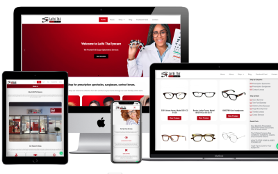
Case Study: Lathi Tha Eyecare — From Outdated to Outstanding
See how New Perspective Design helped Lathi Tha Eyecare grow traffic 124% with a fast, mobile-friendly, SEO-optimized website built in South ...
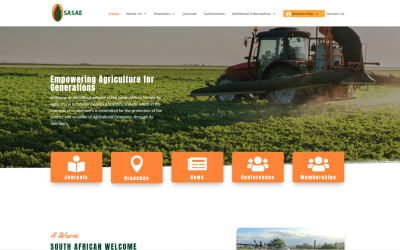
How New Perspective Design Transformed SASAE’s Website and Membership System
SASAE’s transformation proves that the right digital infrastructure can elevate an entire organization. If you're stuck with an outdated system or scattered processes, it’s time to build a solution that fits you—not the other way ...