Responsive Web design
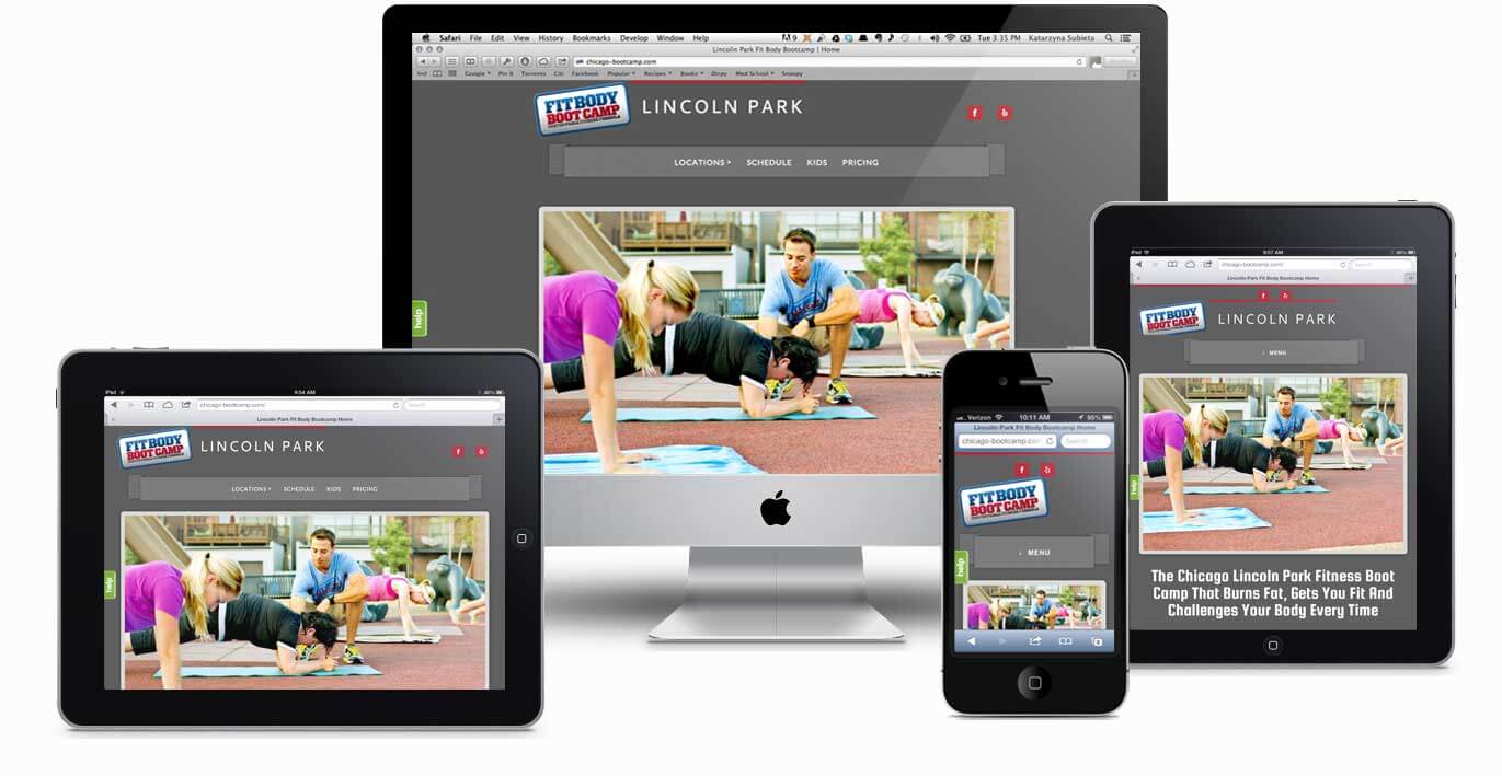
Ethan Marcotte’s groundbreaking article ‘Responsive Web Design’is the point at which people started thinking diffrently about the way web design and development is done. Responsive Design is the process by which a website will respond or adapt according to the different view widths and screen sizes, user behaviour, scripting capabilities and platform.
There are various methods in implementing responsive web design such as :
-
Fluid grid layouts
Fluid grid layout is a method by which you define columns within a screen with and assign elements to those columns via a grid interface. As the screen width resizes the columns will shift into now positions or change sizes.
-
Media queries
Media queries are a set of rules within your cascading style sheet that define a set of rules within a certain breakpoints of a screen size. So when developing a website on a browser you can set a media query to say that if this screen width becomes lower than example 1028 pixels then use the following image or resize the image via rules . Media queries are not limited to changing image sources but colours and all other style sheet rules can be placed within these queries.
-
Bootstrap Framework for web design
Bootstrap is a downloadable framework that is very popular among developers. It includes features such as tables and rows and columns . Most of these elements have Float and resizing attributes already set via media queries and thus move and shift according to the screen size. However when working with bootstrap one still needs a knowledge of media queries and html markup language as often times you or your graphic designer will want to edit the framework slightly to suit you personal design needs.
Bootstrap saves web and graphic designers a lot of time by already supplying them with the bulk portion of the responsive web styling.
However it must be said that in the field of web development we are quickly approaching the point of where we are unable to keep up with the multitude of devices that being created by multiple corporations like Samsung , apple , android , chrome , safari and hundreds of others that i could not mention.
In the modern era we find a bigger variety of browsers , internet explorer , Firefox , chrome , safari. We also have a big variety of devices with an even bigger variety of screen resolutions and scripting capabilities. Responsive web design will adjust and adapt to the abilities of say for example an iPad , and the same script will adjust to display on a chrome browser in a desktop computer.
This in tern eliminates the need to design a new web design and development phase for every device or gadget on the market that makes a appearance.
With the huge advancements in mobile technology like android , iPad and iPhone the usage of the internet has shifted from the desktop computer to these mobile devices. The following graph shows the consumer usage.
We are now 8 months into 2017 and i know for a fact the difference has become even greater.
This graph or even the one before has lead web developers to a new way of approaching web design. They call it “mobile first”. As the name implies
When web pages are designed they are first created and development with mobile features in mind before the desktop considerations.
This makes sense as consumers are using mobile internet and websites increasingly for anything and everything from Facebook to researching a product they wish to buy. Businesses had to adapt to, changing their old unresponsive websites, google analytics now punishes non responsive websites, and new marketing ideas aimed specifically at mobile market , which is becoming the majority market.
I believe this trend will continue but i also believe with more powerful and capable hardware and operating systems on mobile devices, the industry might meet us web designers halfway and make responsive design a little easier.
by New Perspective Design


